
Shopmium is an app that makes shopping more efficient and helps us save money with cash back on our daily purchases.
However, the app's user experience had not been updated since 2015. The goal of this project was to optimise the app and include it in Shopmium's rebranding efforts for their 10-year anniversary.
Before diving in, I want to share the most important lesson I learned from this project: "Choosing is giving up." We had a lot of topics and ideas, but we had to refine and prioritise them to make sure we were only working on the most essential tasks within the given one year time frame. It was tough especially as a young designer full of ideas, but sometimes it's necessary to let go of certain ideas to make the project viable.
How we started exploring
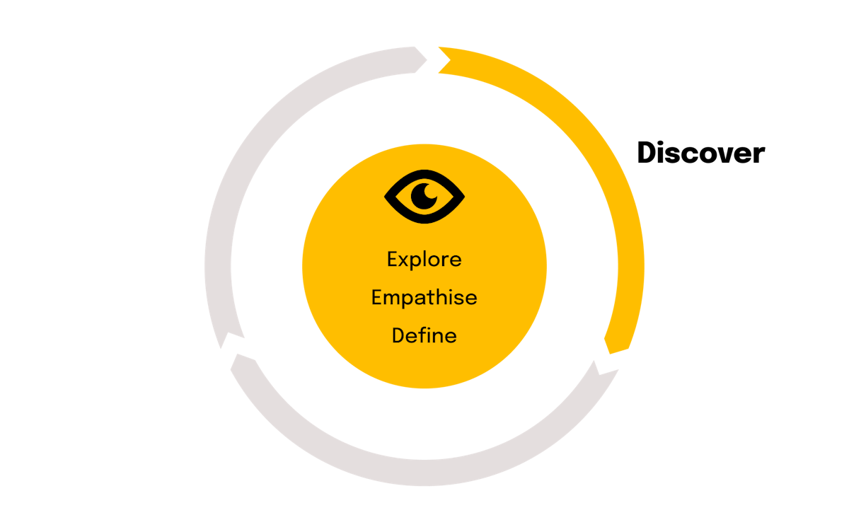
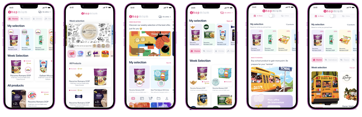
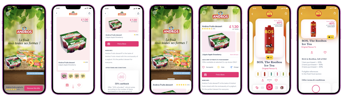
Explore the app
This project is critical to the success of the whole Shopmium experience. We began by familiarising ourselves with the app's user journey to make sure we had all the screens in mind.
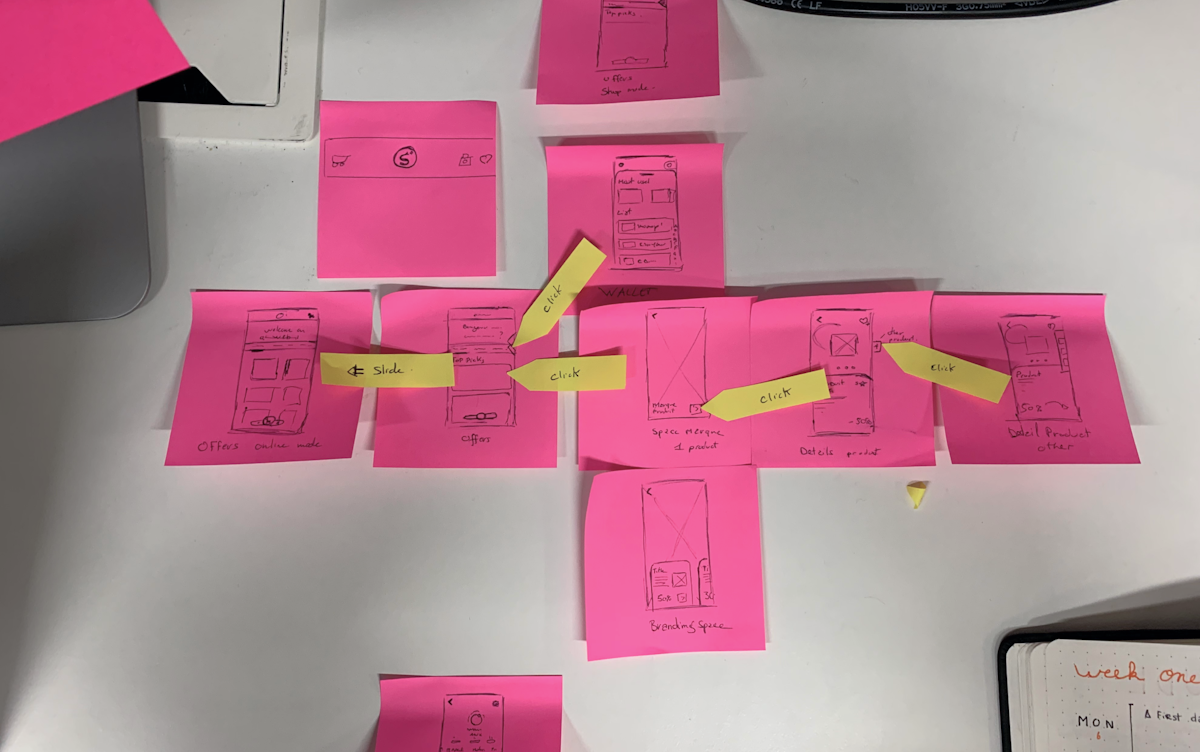
It's important to remember that Shopmium is not just a cash back app, but also a way to connect brands and consumers. So, we always had to find a balance between the brand's perspective and the user's perspective for each screen.

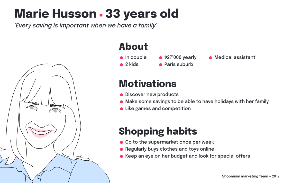
Explore the users
Once we had a good understanding of the app, we gathered information about our users to strengthen our user database and find out what they thought about the app.
We conducted user surveys and interviews. Our user base is mostly women (around 70%), aged 25-40, living in cities.
We also used a very good tool called Attrak-Diff from Testapic to get a precise picture of the users' vision and feelings about the app.

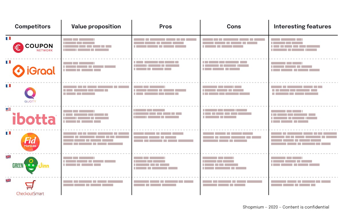
Explore the competitive spectrum
To modernise the app, we needed to analyse where our competitors were doing better than us and where we could invest more time to stand out.
Explore the Shopmium's employees
Unlike the major product’s methods, our product team decided to include the entire Shopmium workforce in the process. This was a great way to gather information and different perspectives from each team. Plus, involving employees in the process made them more open to change since they had a hand in shaping the project.
I was responsible for gathering ideas and getting all of the Shopmium teams excited about the project. I developed ideation workshops and learned a lot from the experience.
Choosing is giving up

At this point, we diverged a lot. Therefore, it is the first round of convergence. We have to narrow the number of idea to the minimum, and think about ways to simplify or optimise ideas.
We used a modified version of the RICE method (Reach, Impact, Confidence, Effort) to prioritise and eliminate ideas. I like to call it “not cooked’ RICE because a lot of variable was non-precise but more in terms of feeling (Low/Medium High). Ideas that required a high level of effort or had a low impact or reach were not feasible for the project. Confidence wasn't a major factor since all the variables were based on feelings.
Refine, Rethink and Test
With a smaller number of ideas, we refined and retested them to make sure they were the best possible solutions. We also made sure they aligned with the goals of the project without the rebranding efforts in mind (to not reveal it yet).
At the product team, we truly think both users and clients/brands desires are equally important, even if sometimes it is an obstacle for the user (the most obvious exemple is the teaser we use for every product offers).
Because of this, and also because it is a large-scale project, we need to validate our best ideas with the teams involved (CSM, Sales, Marketing).
The prototyping phase allows us to find solutions with little effort and great impact to optimise the product.
Overall, redesigning the user experience for Shopmium required a lot of exploration, feedback gathering, and prioritisation. But the end result was a modern and user-friendly app that met the needs of both consumers and the brand.
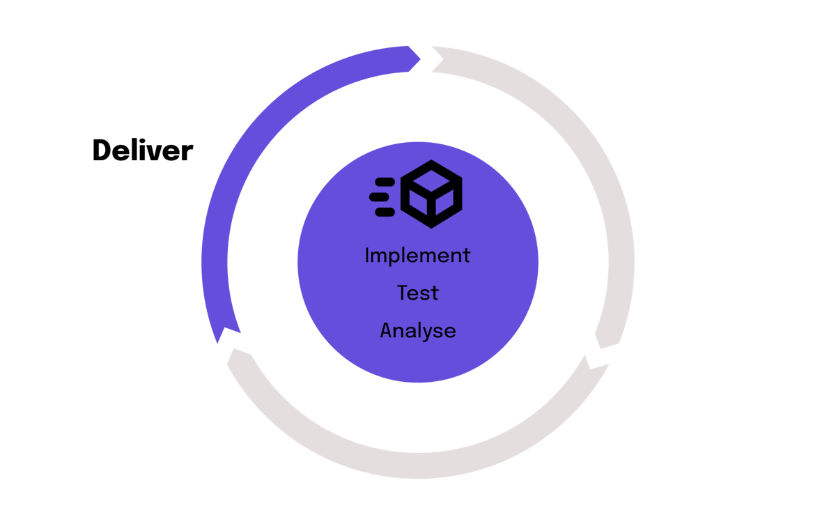
The launch
After a beta test on iOS, we launched the new app on 1st December 2021.
We used 2 different perpectives to analyse and measure how the new app delivers : quantitative (conversion, retention, crashes, user satisfaction) and qualitative (feedback tile on the app, User Happiness Team, comments on store and on social medias).