Shopmium is an application dedicated to change the way we shop in-store or online, by helping us to be more efficient and save money with a cash back on our daily shopping. 2021 marks the 10th year anniversary of the application, a major step for Shopmium.
Our small design team, consisting of Astrid (the creative designer) and I (the product designer), had the big task to reinvent the brand and capture the new Shopmium’s spirit for the next 10 years
Astrid & I worked closely with the leadership team on this project. This rebranding is the first significant change to Shopmium’s identity since the company was launched in 2011.

Working on this project of rebirth was a great responsibility. Naturally, we had to nor update the design guidelines, nor update the voice & tone, but everything had to be rethought from the ground-up.
If Shopmium was originally an application that reimburses our shopping, today we want above all that it accompany us in our shopping…
Shopmium is about to change, to express this new vision!
The new Shopmium vision
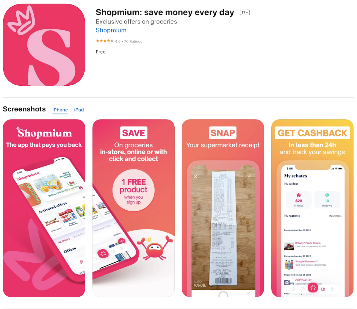
Historically, Shopmium is a cash back app. Users buy their products, go to Shopmium and ask to receive their cash back on the their bank account within 2 days. Everything in Shopmium is geared towards this vision.
In recent years, this vision is beginning to change. The product team & the leadership team want to add more value to the user by offering them more tools to simplify shopping. Thus, we decided to add the possibility to register loyalty cards on the app. We also worked to make available the location of the shops for which the products are available. Finally, we enabled Shopmium members to share their opinions with each other about the products.
On their side, the marketing’s team want to create a true community, communicating as closely as possible with their audience. To achieve this goal, they diversified their posts, mainly based on discount content until now, to funniest content (office day-to-day life, explanation on what we do, cooking tip & tricks,…)
My challenge? Base the rebranding on this more human and entertained vision. Let’s design!
A long way to redesign
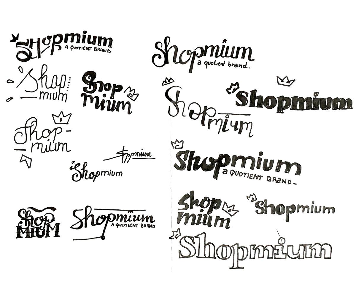
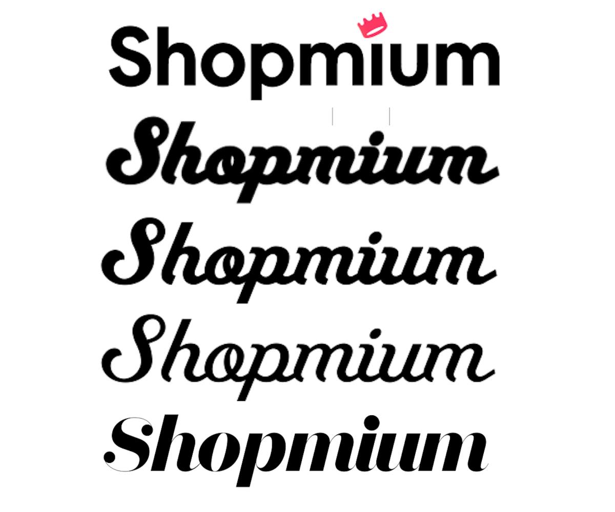
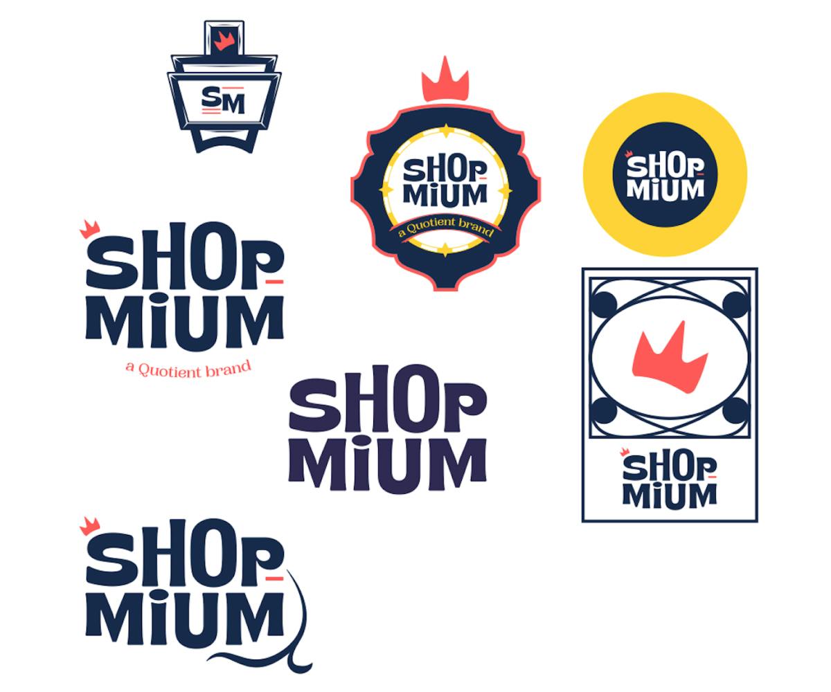
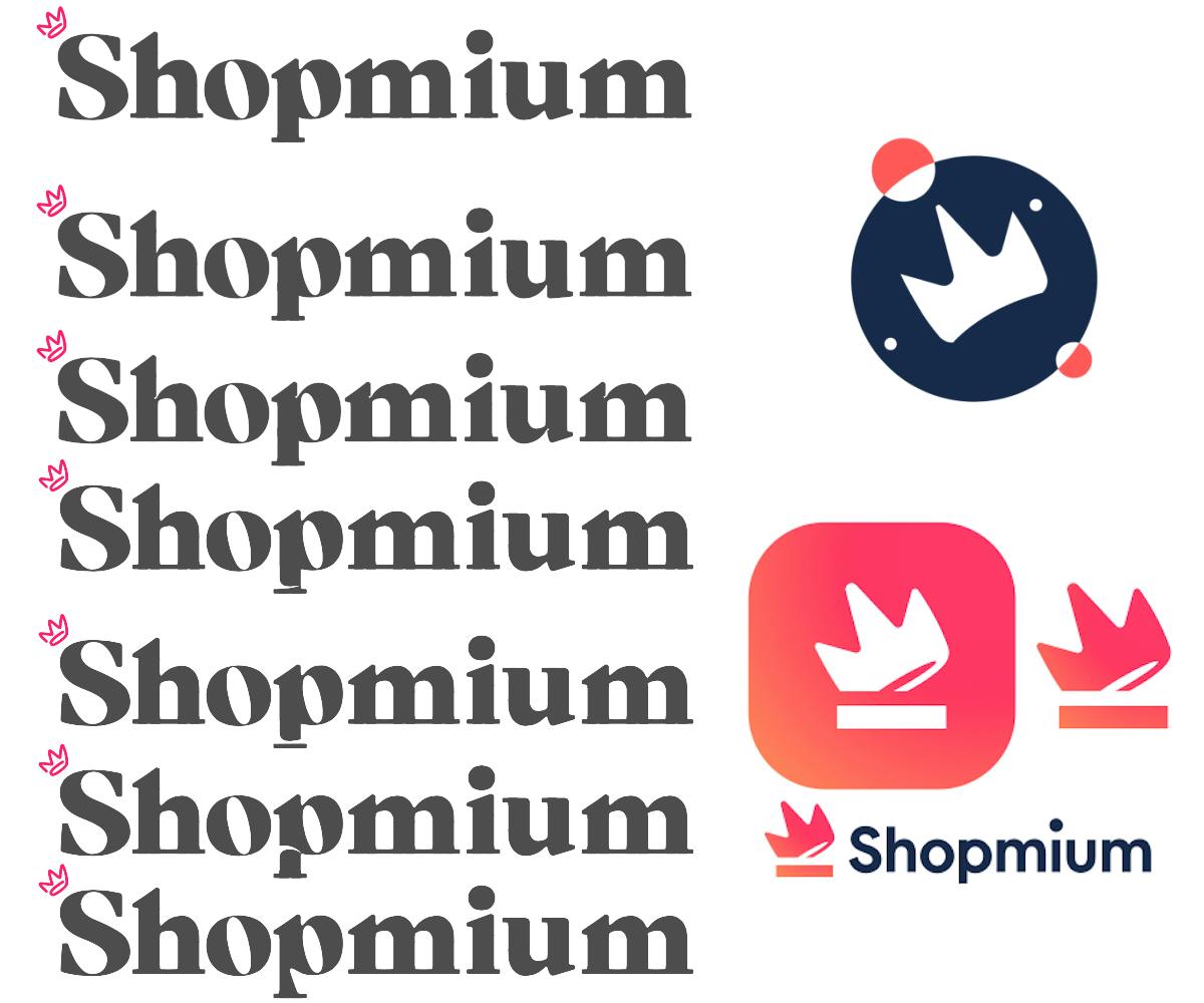
Here we are, let the exploration phase begin! Above all, I want to share with you the approach we had, so that you can enjoy the process of designing the new Shopmium’s logo. I present you the top three logo ideas we firstly developed. The result of each phase is the representation of our advancement.
Sketches

Vectorisation

Exploration Phase
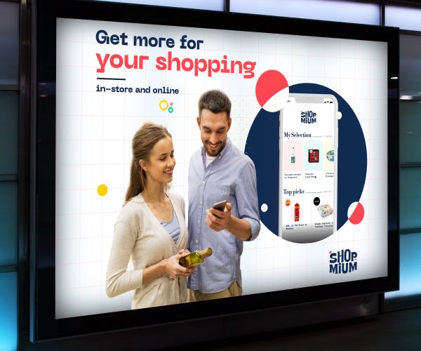
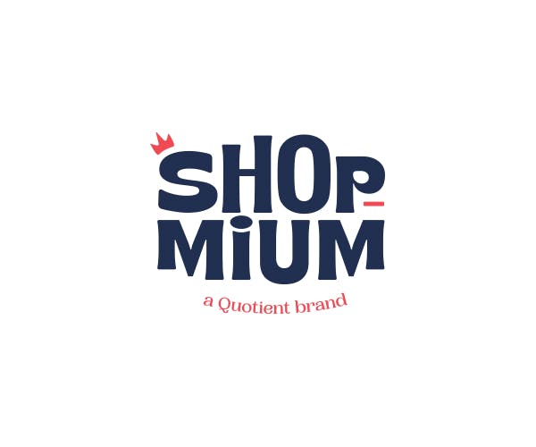
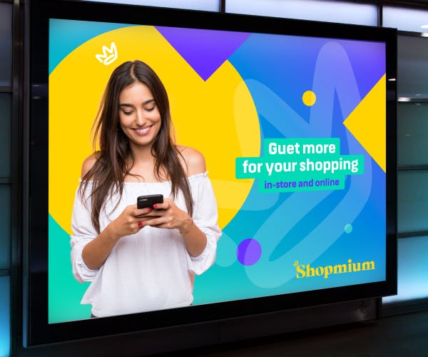
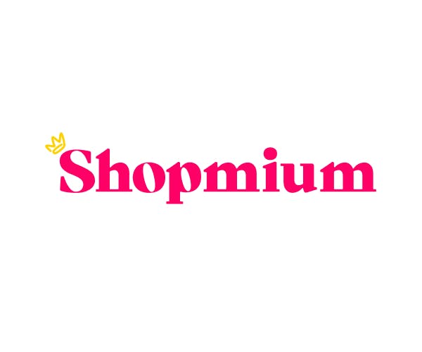
Final Logo

A New Challenger
Shopmium’s rebirth is a dream opportunity to create a new mascot to carry our new vision.
What could be the mascot for a cash back brand? Of course, we wanted better than the expected shopping bag. We explored several objects and animals. Naturally, the crab came out.
There is a lot of symbolism around the crab. It is a fun and entertaining animal with a dancing gait.
In china, it is a lucky animal. In various European countries (France included) it is an animal that cares its resources.
In France, we have a ready-made expression for people who are close to their money : We say “You are a clamp”! (Fr. ‘Tu es une pince’)
Sketches


Final
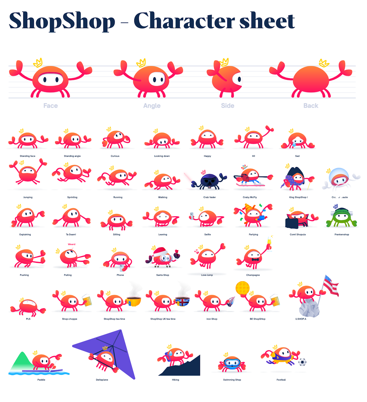
Let's talk about colours
As a graphic designer, colour is always a great challenge. We have explored a lot of possibilities for the main colour.
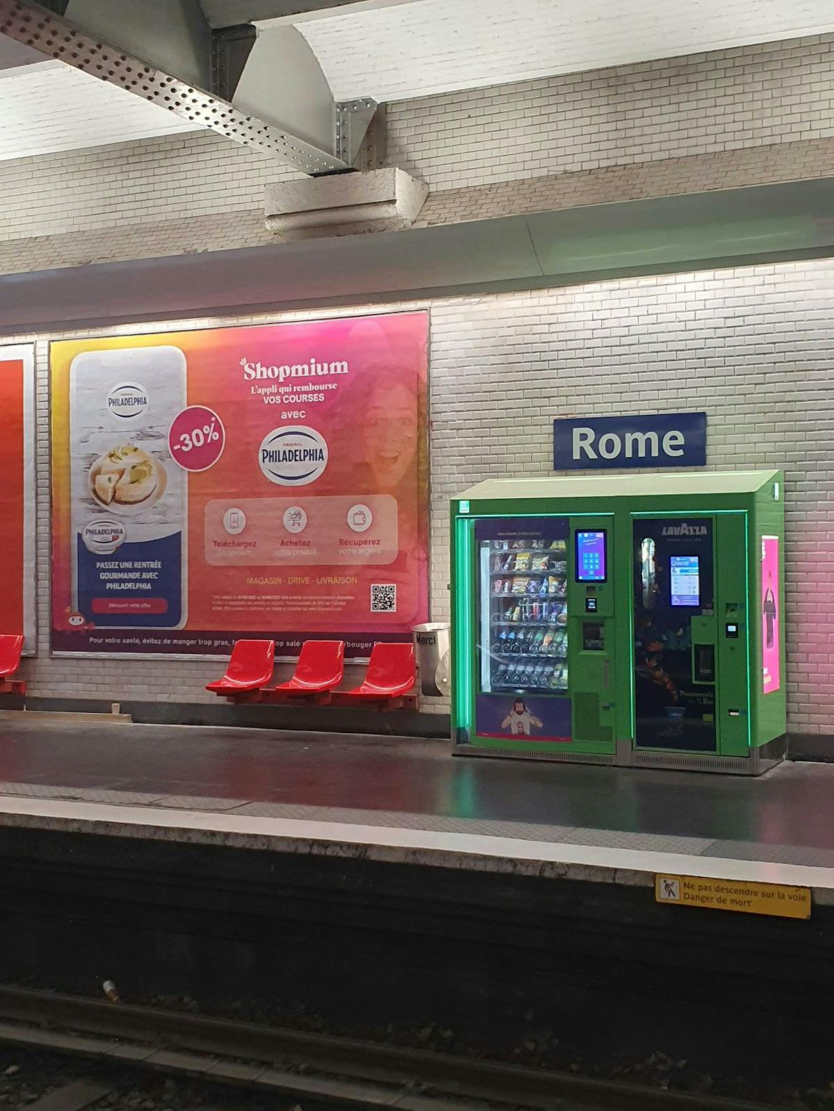
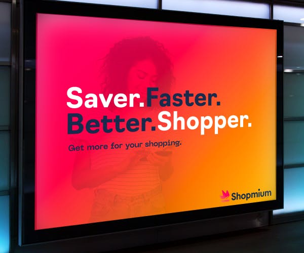
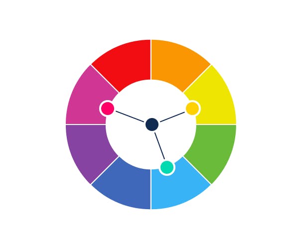
One thing was essential in our choice : How public identifies us? Shopmium is a French brand which has been around for 10 years. It already launched various displays in the Paris Metro and we noticed that our (pink) ads always catch the eyes of the metro users. Our main colour has to be Pink, even if we want to keep the liberty to play with the pink tint.
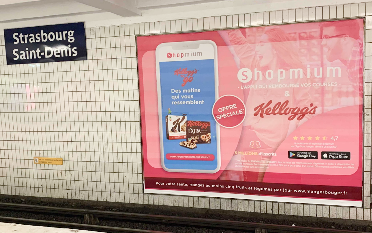
Then, we added 2 colours following the Triad principle : a Yellow and a Mint colour. We also added a last colour: a navy to serve as a neutral colour. Our final palette is modern, vivid and very distinctive.
Conclusion
As a first job after my graduation, it was very exciting to take part in this great project of rebirth, involving responsibilities and teamwork.
